
There actually was a time when the color was more vibrant. It was that way for only a few patches and then some more filters got altered. This was way back in closed beta, somewhere around July I think.

How About A Little More Color?
Started by Megahard, Dec 27 2012 11:35 AM
327 replies to this topic
#102
-

-

- 92 posts
Member
Posted 28 December 2012 - 11:43 AM
 LaHyenne, on 28 December 2012 - 10:55 AM, said:


For one, MW3 was muted from the start...
But I do think the current MWO is too brown and lacks contrasts. Especially River City looks weird, there is NO life at all, no colors, not even in the harbor (lower city start area) with the containers. Only map that I think looks right is Snowy Forest Colony, but that might be because of the contrast between the snow and the rocks.
#103
-
-
- 2,605 posts
Member
- Facebook: Link
- Location127.0.0.1
Posted 28 December 2012 - 11:48 AM
Spiketail Drake, on 28 December 2012 - 11:43 AM, said:
For one, MW3 was muted from the start...
But I do think the current MWO is too brown and lacks contrasts. Especially River City looks weird, there is NO life at all, no colors, not even in the harbor (lower city start area) with the containers. Only map that I think looks right is Snowy Forest Colony, but that might be because of the contrast between the snow and the rocks.
But I do think the current MWO is too brown and lacks contrasts. Especially River City looks weird, there is NO life at all, no colors, not even in the harbor (lower city start area) with the containers. Only map that I think looks right is Snowy Forest Colony, but that might be because of the contrast between the snow and the rocks.
Contrast is a big part of it. Another part though is that for the most part the environments are some kind of monochrome. One color get splatter everywhere in various shades and then a filter is overlaid on everything that's the same color to "tint" the environment further. You end up with things like River city where everything is some kind of brown and often lacking in contrast. It makes the environments feel dull and uninteresting.
On the bright side the environments themselves are the right balance between empty and overcrowded. Other games (Hawken) have worlds that look like someone threw everything they could into the map just because they could.
#104
-
-
- The Fearless

- 322 posts
Member
- LocationGermany

Posted 28 December 2012 - 11:50 AM
Well, after some tweaking with sweetFX the game looks nice.
Less yellow filter, more vibrance, deeper shadows and everything more crisp.
If PGI does not give me the proper tools, then I just get them at the internets
Less yellow filter, more vibrance, deeper shadows and everything more crisp.
If PGI does not give me the proper tools, then I just get them at the internets
#105
-
-

- 932 posts
Member
- LocationBath, UK
Posted 28 December 2012 - 11:53 AM
Looks much better to me with the brighter colours.
#106
-
-
- 2,605 posts
Member
- Facebook: Link
- Location127.0.0.1
Posted 28 December 2012 - 11:54 AM
Blowfeld, on 28 December 2012 - 11:50 AM, said:
Well, after some tweaking with sweetFX the game looks nice.
Less yellow filter, more vibrance, deeper shadows and everything more crisp.
If PGI does not give me the proper tools, then I just get them at the internets
Less yellow filter, more vibrance, deeper shadows and everything more crisp.
If PGI does not give me the proper tools, then I just get them at the internets
Going to have to give that a try. Do you take much of a performance hit?
#107
-
-
- 4,373 posts
Member
Posted 28 December 2012 - 12:00 PM
Dan Baxter, on 27 December 2012 - 11:46 AM, said:
Is it just me, or is the Dragon in the right picture in The Sound of Music?
The hills are alive with Dragons!
#108
-

-
- 128 posts
Member
Posted 28 December 2012 - 12:06 PM
Why did they even add that ******** desaturation filter anyways? It made SPR look like ****, not sure how the devs came to the conclusion that it would look better here.
#109
-
-
- The Fearless
- 322 posts
Member
- LocationGermany
Posted 28 December 2012 - 12:09 PM
TruePoindexter, on 28 December 2012 - 11:54 AM, said:
Going to have to give that a try. Do you take much of a performance hit?
About 2-10% depending on my changes...
#110
-

-
- Mercenary
- 473 posts
Member
- LocationRio de Janeiro
Posted 28 December 2012 - 12:22 PM
M A L I C E, on 28 December 2012 - 07:46 AM, said:

Thank you for your careful consideration.
~ M A L I C E
Actually your picture of the Tank is heavily modificated on Photoshop to make looks brighter, colorful and pretty. (Images-->Adjustments-->Brightness/Contrast)

#111
-
-
- 1,924 posts
Member
- LocationMN
Posted 28 December 2012 - 12:22 PM
I have no problem with the current color scheme.
I would have no problem with a more life-like color scheme (with actual colors).
I would also have no problem PAYING FOR THE OPTION to toggle between the two....
The secret ingredient in that sentence is ....
I would have no problem with a more life-like color scheme (with actual colors).
I would also have no problem PAYING FOR THE OPTION to toggle between the two....
The secret ingredient in that sentence is ....
#112
Posted 28 December 2012 - 01:22 PM
Kaemon, on 28 December 2012 - 12:22 PM, said:
I have no problem with the current color scheme.
I would have no problem with a more life-like color scheme (with actual colors).
I would also have no problem PAYING FOR THE OPTION to toggle between the two....
The secret ingredient in that sentence is ....
I would have no problem with a more life-like color scheme (with actual colors).
I would also have no problem PAYING FOR THE OPTION to toggle between the two....
The secret ingredient in that sentence is ....
paying for the option............. so i have to spend mc to change settings now... is that what your saying?
#113
-
-
- Elite Founder
- 362 posts
Member
- LocationIn a Mech
Posted 28 December 2012 - 01:26 PM
How about a Setting to Turn up the saturation in the options menu?
Or how about a PGI made file to drop in the game folder that does this...
(kinda like the SKYRIM HD texture pack)
-
edit:
If they charged MC to change the color scheme, I really would stop playing
Or how about a PGI made file to drop in the game folder that does this...
(kinda like the SKYRIM HD texture pack)
-
edit:
If they charged MC to change the color scheme, I really would stop playing
Edited by Lagfest, 28 December 2012 - 01:27 PM.
#114
Posted 28 December 2012 - 01:26 PM
Gotta agree with his royal edict. Paying for better graphics would be uncool. I understand the sentiment, but I would not stand to be charged to see a better graphic... unless it was an across the board cost to everyone.
#115
-
-
- The Fearless
- 322 posts
Member
- LocationGermany
Posted 28 December 2012 - 01:32 PM
Well, getting closer to the sweet spot, I oversaturated a little, to show the difference...
Vanilla with slight changes to filter:

with stronger modifications:

Using diagonal split screen: (upper left nearly untouched / lower right heavily saturated, more vibrance)

I use settings slightly less saturated, for more realism...
Vanilla with slight changes to filter:
with stronger modifications:
Using diagonal split screen: (upper left nearly untouched / lower right heavily saturated, more vibrance)
I use settings slightly less saturated, for more realism...
Edited by Blowfeld, 28 December 2012 - 01:44 PM.
#116
-
-
- Elite Founder
- 362 posts
Member
- LocationIn a Mech
Posted 28 December 2012 - 01:33 PM
This is the real world, no photo effects or changes applied: Germany and Tucson
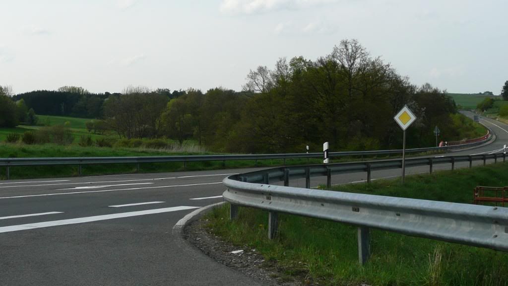
and this:
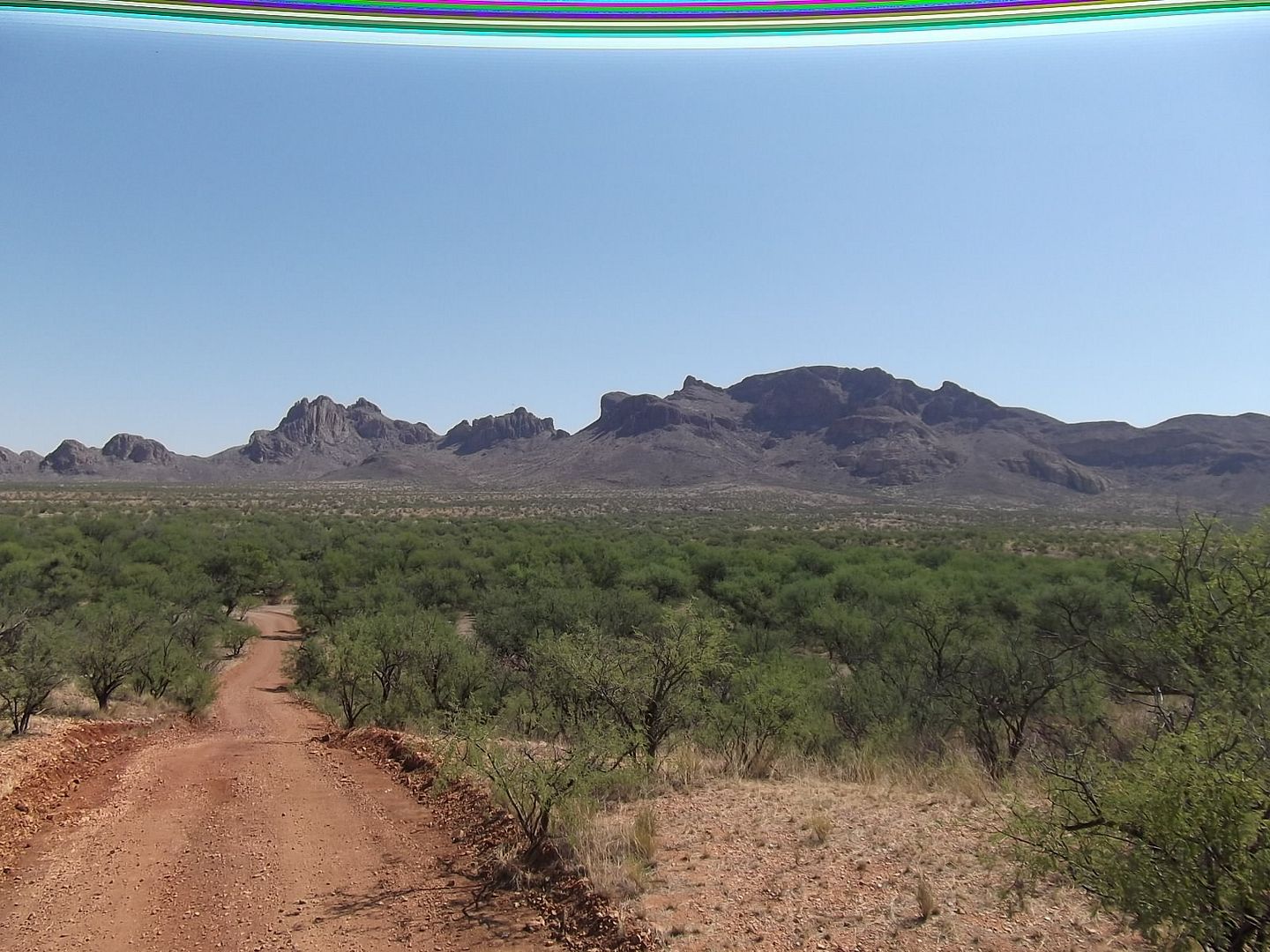
and this:
#118
-
-
- Elite Founder
- 362 posts
Member
- LocationIn a Mech
Posted 28 December 2012 - 01:47 PM
Well thank you malice, I appreciate your obviously superior expert opinion.
#119
-

-
- 216 posts
Member

Posted 28 December 2012 - 01:50 PM
Livewyr, on 27 December 2012 - 11:58 AM, said:
I think the color filters should vary between matches.. weather and light have different effects on colors.. (example, look at a cityscape during the cold season with sunlight, and then in the hot season.. cold season is actually more vibrant in the sun.)
Great idea! Some brownish fog is okay from time to time too, but not all the time please. Give us some colors for a change!
#120
-
-
- 436 posts
Member
Posted 28 December 2012 - 01:50 PM
M A L I C E, on 28 December 2012 - 01:35 PM, said:
In seriousness though, that's a horrible exposure from a crappy camera that has no dynamic range. Not actually a decent representation of what that scene would actually look like to a human eye.
I disagree. Depending on the time of the day and the weather conditions, it actually can look like this. The colour of the pavement, guard rails and signs seem pretty normal to me. Only the grass in the background looks really green to me...but it's nothing I have not seen...
Edit: I prefer the "more colourful" Version of MWO.
Edited by Bromineberry, 28 December 2012 - 01:52 PM.


1 user(s) are reading this topic
0 members, 1 guests, 0 anonymous users


