The UI2 Mechlab needs some serious rethinking. Did no one check for contrast issues on the White text/powder blue for Missiles?
I'm partially colorblind and having the white text on a relatively light background is next to impossible for me to read. So I can't tell if I've got an SRM6 in there or an SRM4.
The ratio and use of UI space seems very off as well. I get that you're trying to show what items/equipment we can slot in, but if the area to drop items in is 1/10 the size of the inventory screen, and the text is hard to read I don't think it's an effective UI scaling.
While I can see the attempts at making the UI more interesting, I feel like it's too focused on "pretty" looks and not enough on usability/efficiency of conveying actionable information to the user.

Ui Feedback
Started by Elder Thorn, Feb 04 2014 12:28 PM
1175 replies to this topic
#262
-

-

- Overlord

- 1,659 posts
Member
- Location...straying in the Inner Sphere...
Posted 05 February 2014 - 12:28 AM
-all buttons and functions are spread all across the UI, there is NOTHING intuitive/ ergonomic about it..
you probably get used to the new UI after a while, but still ... you have to look for this, look for that, all across the screen or even hidden in different windows... the only thing that is better than before is that you don´t have to scroll across 20+ mechs anymore...
-i like the new chat window (multiple tabs for different conversations) , although i hope you´ll add public chats some day
don´t wanna mention all the bugs (floating weapons on the mechmodel etc.) since we all knew it would be full of bugs... you guys have been honest with this, i´ll have to give you that much
-i have to agree with someone on page 1: i want to see my mechs, and my mechs only... not a shiney BUY button all along with the trial mechs sneaking into my mechbay.
-Testinggrounds are in the "home" tab, not somewhere close to the launch interface... that is - as mentioned - counter-intuitive
all in all too much to write about, besides the fact it seems very lovelessly designed, ugly and appearntly without any pattern how buttons and informations are arranged...
#263
-

-
- Legendary Founder
- 3,625 posts
Member
Posted 05 February 2014 - 12:36 AM
I would like to see the following info on the pop out on the mech selection page (without to many button presses)
This may have been mentioned but a new page of posts appeared whilst typing this.
Make that 5 pages
Engine size in a mech
Free slots in a mech
modules in a mech
You need to design a new user interface
ie an interface for new users
This ones scary (run for your lives)
When It comes to UI less is more and more is less (Apple)
Stop letting the accountant design the game
Edited by OZHomerOZ, 05 February 2014 - 12:37 AM.
#264
-

-
- Bad Company

- 267 posts
Member
- Location36th Dieron Regulars
Posted 05 February 2014 - 12:36 AM
Sorting Mechs is pretty bad. You have the Option to sort in "bought" and "none bought" Mechs. Kinda rediculous. Also I dont like, that Hero Mechs are seperated from normal Chassis.
Good thing is, Mechs can renamed again.
Good thing is, Mechs can renamed again.
#265
-
-
- The 1 Percent

- 1,459 posts
Member
- LocationSydney, Aus.
Posted 05 February 2014 - 12:45 AM
Lots already noted.....
few minor things....
In the home screen under "select mech",
1. add the ability to double click a mech to jump straight into the mechlab with that mech selected etc.
2. add a few picture icons next to the cbill icon as well, one for "take mech to mechlab", one for "launch game with this mech" (granted these last 2 icons only save a click or 2 but still.... )
)
In the mech lab screen under "inventory"
1. Remove champions from the "owned" filter please (unless I own them ofc), I dont want to see mechs with a "buy" button with that filter selected, I want to see the mechs I actually OWN.
Will add more as they come.......
few minor things....
In the home screen under "select mech",
1. add the ability to double click a mech to jump straight into the mechlab with that mech selected etc.
2. add a few picture icons next to the cbill icon as well, one for "take mech to mechlab", one for "launch game with this mech" (granted these last 2 icons only save a click or 2 but still....
)In the mech lab screen under "inventory"
1. Remove champions from the "owned" filter please (unless I own them ofc), I dont want to see mechs with a "buy" button with that filter selected, I want to see the mechs I actually OWN.
Will add more as they come.......
Edited by Fooooo, 05 February 2014 - 12:50 AM.
#266
-
-

- 41 posts
Member
- LocationCA

Posted 05 February 2014 - 12:48 AM
My two cents, er, credits:
The Good:
- Love that you can configure weapons groups without having to go into a match!
- Love that I don't have to sit there scrolling through my list of mechs to go from one end to the other!
- Like the way you can see all the components when doing load outs so you can just quickly get to them.
- I can rename mechs!!!
- Armor and weapons loadouts at the same time, nice.
- You aren't prompting me to save changes just because I dropped into the camo spec section without having done anything!
- The performance graphs look cool. The pitch/yaw and weapon range illustrations, priceless!
- Social's updated statuses are nice. Last online would be nice too. Search and sort would be better.
The Bad:
- Please let me hit escape or some key (or button on screen) to quit out completely and instantly. Logout then exit? Wasting my time. Better yet, escape to exit anything I'm in with the final escape at the home/top level = prompt "Logout/Exit/Cancel".
- The skills interface looks cool. But, now I've got to go back and forth to switch between mechs/trees. Maybe a drop-down? Dunno. You might like to sort by hero vs champion vs regular mechs. I like to sort by class and chassis...just saying...
- I don't mind the loss of the silhouette but I do find it a bit weird having to go down a list to figure out where on the mech I want to change the loadout. Maybe a clickable overlay or something as a short cut in addition to the list of locations?
- MechLab needs a sorting mechanism. Three mechs of the same class are in different places and I can't sort or drag-and-drop to reorder. Very annoying, though we didn't have a way to reorder before.
- I dunno about tonnage being so small and out of the way during loadout. It's one of the biggest factors (beside slots) when loading a mech out and it's all tiny at the bottom...
- Double-click to perform the primary action, please. Nice big targets = great, tiny little buttons = fine if there were more of them.
- And double-click to add/remove items during load out. That was a great feature before, quick in and out.
- It'd be nice to be able to filter multiple game types (e.g. Assault + Skirmish only) and maps.
- Wait: How do you sell spare components now?
Nice set of changes. Definitely slick and glad they're here finally.
Edited by LoneGunman, 05 February 2014 - 12:57 AM.
#267
-
-
- The God of Death
- 149 posts
Member
- LocationBerlin

Posted 05 February 2014 - 01:13 AM
The new UI is quite - uhmm - ööhhh - different!
At least: Something new is better than nothing new.
Feedback:
The new UI is not self explaining, it's even more an expert tool than easier to use coplared to UI 1.5
My points of constructive critic:
1. Mech overview:
When I try to find out the loadout of one of my owned mechs I need to hover the mouse over the symbol and wait a quite long time until the mechstat box apears. This annoying stupid since a new player will never stop to move the mouse around searching for the loadout.
Especially annoying is that the "hover out" happens only in the mechlab and not in the shop view. This is inconsistent and there is no way to know what you are buying while you are in the shop.
The current way to buy a wanted mech(and not just some goodlooking one) is to move on smurfy, write down the name of the wanted mech and then return to the shop an d buy that.
=> fix for that:
remove the mouse over for the hoover.
remove the delay before the slide in.
remove the slide in effect at all.
always show the overview for the selected mech.
2. The nice mech overview shown turn rate and such nice stuff but it lacks to show installed modules and cockpit items. This is even worse than in UI 1.5
=> fix for that:
add installed modules and cockpit items to mech overview.
nice to have: Strip modules button in overview
3. Layout
All boxes align at one side/edge of the screen. I just suggest you take a big monitor, high resulution(1980x1200 and above) and sit about 1y away of it. You will quickly recognize the problem:
You have a big hole in the middle of the screen and you will not easy recognize:
Filters, blinking social icon, changes in friendslist etc
Instead you will turn your head around searching for some information.
All eye focus pionts are way to far from each other.
I start to filter a mech to an assault on top left screen side,
put a filter on a small (not that easy to find) pulldown in the upper left 2nd menu row ,
then I need to rest my mouse over a mech in the center/left of the screen,
than a box shows up in the right upper part of the screen
with efficiency shows up at the right bottom
I then might want to select to edit that mech starting in the top menu center and than the turnaround starts again.
fix for that:
let the player position the widgets(chat, social, mechlist, overview etc) and make them all sizeable/draggable.
4. add Filters
Though the filter pulldown are present at modules, and loadout there is missing any listitems.
fix:
add the default list Owned/puchasable/all to all filter boxes.
5.: The Plan
is not updated yet. Didn't you do anything the last two weeks? I can not imagine that.
The new UI has potential, but I would set "Improve Usability" as a new story to "The Plan" with 30% accomplished.
5cts
Edited by Rhalgaln, 05 February 2014 - 01:18 AM.
#268
-
-
- The 1 Percent

- 145 posts
Member
- LocationOh1O
Posted 05 February 2014 - 01:13 AM
UI 2.0 is bad. It looks like a Nintendo game from 1989. I don't think i can carry on supporting this disaster. I have tried to play since the patch, but my eyes bleed and brain scream and i log out. After spending an hour in the mech lab and completing 5 matches since the patch, i simply cannot play any longer. Best wishes PGI.
#269
-

-
- 33 posts
Member
- LocationGermany
Posted 05 February 2014 - 01:17 AM
I didn't have much time yesterday so I just clicked through my mechbay for a bit.
The first impression of UI 2.0 is very disappointing.
It's no longer possible to have a windowed mechlab without playing the game in windowed mode. I don't like it, since I was used looking at websites like smurfy while configuring my mechs (ironically, I thought UI 2.0 would make websites like smurfy obsolete... how naive was I?).
The font is tiny (in 1920*1200 on a 28.5 inch screen), so that I had to squint the whole time.
I thought I could order my mechs myself, but instead I have way too few filters which show mechs which don't belong into the filtered category. I had hoped to order them via drag and drop, for example. Also, the thumbnails of the mechs should show their actual camo.
The big area in the center of the screen always shows its contents as a thumbnail-roster with no option to have it shown as a list, which would make navigating a LOT easier (besides, looking at dozens of identical thumbnails of engines and guns really doesn't add anythiing to the game).
I have to click CONFIGURE to actually see the loadout of the mech, and then it's only shown as tiny popup and only for the selected part of the mech. Are you kidding me? I literally have to SEARCH through my mechs if I want to use something on another mech (XL engines, mostly).
Conclusion:
I was really looking forward to the new UI, especially since the old one was really, really bad. And now... well, lets just say I would've never thought that a few minutes with the new one would actually make me wish the old one back.
The new UI is a "clickfest" with tiny fonts, a LOT of wasted space and no new functions at all.
Come ON now, didn't you even try out the UI for yourselves?!
Yes, in case you couldn't tell, I am actually quite angry - and I am usually a person that does not become angry at or with computer games. But in this case, I am angry that so much (!!!) time was literally WASTED to produce THIS. This game deserves something better.
Edited by Drybone, 05 February 2014 - 01:20 AM.
#270
-
-
- The Territorial
- 172 posts
Member
Posted 05 February 2014 - 01:25 AM
nice social upgrade regarding to new ui, inventory button is also nice, but rest of stuff still needs some work to do whole ui is too messy too much things going on and small buttons.
found few bugs like:
1. you dont see if mech have equiped BAP, you can see in mechlab everything if it got ecm ams but theres no BAP, you have to go into current mech to search where you got BAP or if that mech even have it
2. You dont see ENGINE size in mechlab same as BAP you have to go into current mech lodaut to look on it and even that doesnt show tonnage of engine so you have to go thru that powerpoint presentation of engines where everything looks same which is completly messy, you cant even separate xl and std engines thru filters
3. You dont see Modules in mechlab, also new weapon modules, modules and consumables have all same color in module page and they all look same its hard to navigate which is which
4. what are trial mechs doing in owned mech filter i dont understand.......
question why we cant rotate mech in Home section but only in mechlab section ?
edit:
turrets are amazing also numbers of them was quite nice suprise
also i noticed flying lrms lost their smoke trail or something
Edited by JuiceKeeper, 05 February 2014 - 03:51 AM.
#271
-
-
- 133 posts
Member
- LocationZagreb, Croatia
Posted 05 February 2014 - 01:31 AM
Ok, my first impression, sorry, but this is horrible.
I wanted to find an engine that was on one of my mechs and transfer it to another one.
1) It took me three clicks just to get to another mech, another two clicks to see if it has the engine I've been looking for installed, then another three to switch to another candidate, two more to uninstall the engine, and another five to get back to the mech I wanted to install the engine to in the first place. COME ON PEOPLE! It all looks nice, but is a nightmare to use. Have you got anyone with any understanding of ergonomics on your team? Please rethink this. You need some sort of a menu that will wnable user to quickly inspect and switch through the mechs.
2) The popup with mech stats is nice but takes a bit too long to pop up. It needs to be more fluid, and it needs to come up when I click on a mech. And certaninly it needs to display engine type I have installed...
Edited by ego1607, 05 February 2014 - 01:35 AM.
#272
-

-
- 238 posts
Member

Posted 05 February 2014 - 01:35 AM
The escape key still fails to open or close menus. Basic stuff there.
Also probably been mentioned somewhere in the 14 pages, but it's easy enough to work around the module bug by dis-equipping them, clicking purchase with empty modules, then rebuying, which will cost you cbills, even though it shows that you have one of the modules in your inventory.
Also probably been mentioned somewhere in the 14 pages, but it's easy enough to work around the module bug by dis-equipping them, clicking purchase with empty modules, then rebuying, which will cost you cbills, even though it shows that you have one of the modules in your inventory.
#273
-
-
- 14 posts
Member
- Locationıʞɐsɐbɐu
Posted 05 February 2014 - 01:43 AM
This UI has done NOTHING, I repeat, NOTHING, but add more clicks and restrict information.
You'e made editing loadouts more difficult by refusing to show a pane with equipped weapons/components.
You've disabled the ability to quickly click on your mech's torso or arm to edit that slot.
You've taken out the ability to, aside from spinning the mech around and searching, easily identify weapon hardpoints.
You've added 1-2 extra mouse clicks to access almost EVERYTHING.
You've added filters to trivial item sections and omitted them where it counts; THE LOADOUT SECTION!
You shouldn't have released UI 2.0 until it was ready. Please fix.
inb4 UI 1.0 available for 1000MC, "promised" for 2014 release along with windshield wipers, factions, community warfare and the ability to FOOKIN' PICK WHAT MAPS YOU WANT TO PARTICIPATE IN.
Oh, sorry. F****n'. God forbid someone swear on the forums. IT's fine to do so in game, there's no filter, you don't care, but OH NO NOT ON THE FORUMS.
#274
-
-
- 13 posts
Member
Posted 05 February 2014 - 01:44 AM
 Butane9000, on 04 February 2014 - 05:37 PM, said:
How did this elude you???

This!
But let me elaborate a bit. First I would like to say that despite the current problems I think UI2.0 is a step forward. Perhaps currently not in terms of usability, but I guess that most of the changes are "under the hood" and are not visible on the surface. PGI has stated many times that they do not see the UI as finished and I think we all agree it still needs work.
For a huge part of the player base building and refining these magnificent death machines is a crucial part of a Mechwarrior game. Personally I have spent almost as much time in Smurfy building mechs, as I have spent in game piloting them.
So instead of reiterating singular suggestions that were already made by others, I would ask PGI for one thing: Please sit down and think about the worklfow of building mechs. Ask yourself why people prefer to mock up mechs in smurfy, then go into the Mechlab to build them.
Two key points:
Clarity - Have all relevant information available at a glance
Have all the relevant information accessible on one screen. Always. Make the important parts easy to find and to decipher:
My thought process when building a mech looks something like this: "Firepower seems low. Maybe I can replace the AC5 with an AC10.. crap, not enough free slots in the arm.. okay, maybe I can replace one of the MLas with a LLas in Right Torso... might work if I shift the ammo around.. but LLas is still too heavy.. ok I could lose one of the JJs in the CT then it fits.. but now heat efficiency is terrible.. perhaps I could cram another heatsink somehwere in there... "
A good UI supports this kind of thought process. And the crucial part for it is to have all the required information ready at a glance. That is why Smurfy is so perfect for me.
General Usability
Make things that are frequently done easy. For example finding/adding/removing equipment for the mech. For Example: using doubelclick to remove items is a lot more convenient than drag-and-drop... there are many others, you get the idea.
In general: please sit down with the UI and try to build a mech from scratch. Try to optimize your loadout. Compare your experience to Smurfy. If it feels more annoying / cumbersome than smurfy, then improve.
PGI, thanks for your continued effort. I am sure you put a lot of work in the new UI, and while it is not quite there yet, I am sure it is a step forward from a technical/backend perspective. I assume it will make many awesome things possible in the future, but the frontend and usability needs some more work
Edited by somanov, 05 February 2014 - 05:51 AM.
#275
-
- Survivor

- 3 posts
Rookie
Posted 05 February 2014 - 01:50 AM
I have to echo a previous comment - it is now virtually impossible to know what you are buying when purchasing a new mech.
Firstly, the order of the mechs is very unusual - it's not alphabetical or by any sort of index I can figure out, apart from 'Hero Mechs First', of course. There is obviously some tonnage sorting,but even then the Jenners are mixed up with the Ravens.
Then, you get absolutely no information about the mech you might be interested in. Clicking on it, hovering over it and hoping for a tooltip etc. gives you nothing. How about either a pop-up informational overlay, or a button for a 'tour' of the mech that shows the 3D model and gives us some stats? You get some GREAT statistics on the mechs you own when you select them - but this info would be much more useful when buying a NEW mech.
It's unusual to miss such a vital feature in a system that actually generates income for yourselves - making it harder for people to understand the benefits of the Hero mechs by checking their specs is not helping your users OR your bottom line.
NOTE: The top of the mech list looks like it will eventually have buttons to choose between 'image' and 'line' view. Getting that implemented so that the mech buying interface looks a little more like the skills list could be useful.
#276
-

-
- 435 posts
Member
- LocationDeutschland
Posted 05 February 2014 - 01:51 AM
The beta is over.
UI2 is a joke!
UI2 is a joke!
#277
-
-
- Shredder

- 1,907 posts
Member
- LocationFracking the third toaster.
Posted 05 February 2014 - 01:51 AM
Dun, dun, dun, dun Pgi strikes again!
Hawken goes from strength to strength MWO goes from Frustrating to down right annoying and confusing and no it isn't just learning a new UI, Its a mess! The fact that they have to post youtube videos to explain how to use it says it all. It isn't User friendly, navigating it is a chore and i have no idea where to find anything. Its all in the same font type and very similar size and not segregated. There's barely any use of colour too. I've used CAD software and Photo editing software that is more self explanatory than this. If i wanted to kit my mechs out in Microsoft Excel i would do.
How is it that a free mobile phone game can have a UI that's a piece of piss to use and even have IAP's that are optional and not forced in any way. (Table top racing for one).
So i want to go into my mechlab and look at MY mechs instead their lost in a sea of other mechs they're clearly trying to tempt you with only highlighted by a different colour tab underneath (so if i was colour blind i'd be ******* clueless. The filter does jack shit too.
Sucker for the game i may be but its getting a bit insulting now.
BUT
AT A GLANCE it looks nice and my mech looks graphically better that's all.
Edited by mad kat, 05 February 2014 - 03:38 AM.
#278
-
-
- 575 posts
Member
- LocationTokyo
Posted 05 February 2014 - 01:52 AM
How do you sell stuff? (Unwanted mechs/equipment etc) I can't work it out for the life of me.
#279
-

-
- 40 posts
Member
- LocationLow Earth Orbit
Posted 05 February 2014 - 01:54 AM
Not going to read through 14 pages of this to see if it's already been said. I already said my piece over here in the UI thread here that the big issue is with loadouts/mechlab:
http://mwomercs.com/...opic/149289-ui/
So I'll just repost it here and elaborate a bit more:
...you can't look at a basic loadout of what your mech carries. If you already have a mech built, or are looking at a new one, rather than have an interface that shows what gear a mech carries, you see nothing.
The old interface allowed you to hover over different locations, hover over the hardpoints, hover over the locations, and see the equipment.
It wasn't great, but was somewhat intuitive.
This is easy to navigate - you can see where your gear is, you can see a gear summary, and armor is easy to read:

Things are aligned like how the mech stands.
This is easy to navigate - you can see locations and gear at a glance, and work with it from there:

This is easy to navigate (arguably the best part of the old interface):

You can hover over your limbs for hardpoints, you can hover over your equipment details on where it's located, you can see what your mech is loaded out with in the summary at right.
And individual locations were just as easy, with a diagram that makes sense, and represents the layout of the mech itself.
You could select locations, and during build they were aligned with what you're looking at.

And you could zoom back out and get your summary of the mech with your loadout listed. Would've been handy to see an ammo counter someplace - that would've been helpful, but overall it wasn't too bad.
This 2.0 crap is crap, where every location is compacted on the left side of the screen, they can't all be seen at once, equipment and hardpoints are hidden under menus, the location loadout shows up on the right while the list of locations is on the left, icons are pointlessly huge for no reason (the only difference in the vast majority of engines is the numbers - not the pictures) and etc:

This is counterintuitive to decades of Battletech and Mechwarrior games. The interface is the easiest thing to get right. You even can do a vertical list without making it difficult to use.
You don't split locations across the screen, and make them only accessible one at a time - you put them together.
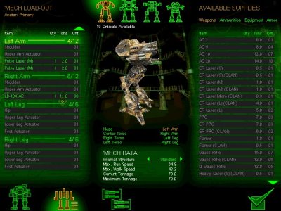
Simple, easy to read, and a complete summary, and it even makes the vertical menu readable if that was something that somebody at PGI just had to have:

But see that - there's a "current loadout" tab that shows what you carry, that gives basic info on the whole mech, and lets you know what your build is.
UI2 doesn't have any of that.
It was "fixed" into being overcomplicated, counterintuitive, incomprehensible to new players and old.
-
The ability to look at all purchaseable mechs at once is nice... but you can't look at their loadouts or locations either... which defeats the whole damned purpose.
The more I've read about this, the more I see people saying "we're going to introduce the smurfy interface in 6 weeks" or something, which as someone who isn't going out of his way to follow the development of MWO... I can see that's like a contractor promising to get your plumbing/sheetrock/tile work done in "two weeks"...and in the meantime has torn your house up and left it a mess just to show they did something.
Some elements of the new interface aren't bad (again, like being able to see all the purchaseable/owned mechs at once), but so much of the mechlab was screwed up for no discernable reason that it's very frustrating.
Several folks I play with have decided not to spend money on MWO because the game keeps being "fixed" in ways that make it frustrating - worse rather than better - and a needlessly complicated mechlab is no small part of that. I've got some patience, but mostly because I'm a loyal Battletech fan.
http://mwomercs.com/...opic/149289-ui/
So I'll just repost it here and elaborate a bit more:
...you can't look at a basic loadout of what your mech carries. If you already have a mech built, or are looking at a new one, rather than have an interface that shows what gear a mech carries, you see nothing.
The old interface allowed you to hover over different locations, hover over the hardpoints, hover over the locations, and see the equipment.
It wasn't great, but was somewhat intuitive.
This is easy to navigate - you can see where your gear is, you can see a gear summary, and armor is easy to read:
Things are aligned like how the mech stands.
This is easy to navigate - you can see locations and gear at a glance, and work with it from there:
This is easy to navigate (arguably the best part of the old interface):
You can hover over your limbs for hardpoints, you can hover over your equipment details on where it's located, you can see what your mech is loaded out with in the summary at right.
And individual locations were just as easy, with a diagram that makes sense, and represents the layout of the mech itself.
You could select locations, and during build they were aligned with what you're looking at.
And you could zoom back out and get your summary of the mech with your loadout listed. Would've been handy to see an ammo counter someplace - that would've been helpful, but overall it wasn't too bad.
This 2.0 crap is crap, where every location is compacted on the left side of the screen, they can't all be seen at once, equipment and hardpoints are hidden under menus, the location loadout shows up on the right while the list of locations is on the left, icons are pointlessly huge for no reason (the only difference in the vast majority of engines is the numbers - not the pictures) and etc:
This is counterintuitive to decades of Battletech and Mechwarrior games. The interface is the easiest thing to get right. You even can do a vertical list without making it difficult to use.
You don't split locations across the screen, and make them only accessible one at a time - you put them together.
Simple, easy to read, and a complete summary, and it even makes the vertical menu readable if that was something that somebody at PGI just had to have:
But see that - there's a "current loadout" tab that shows what you carry, that gives basic info on the whole mech, and lets you know what your build is.
UI2 doesn't have any of that.
It was "fixed" into being overcomplicated, counterintuitive, incomprehensible to new players and old.
-
The ability to look at all purchaseable mechs at once is nice... but you can't look at their loadouts or locations either... which defeats the whole damned purpose.
The more I've read about this, the more I see people saying "we're going to introduce the smurfy interface in 6 weeks" or something, which as someone who isn't going out of his way to follow the development of MWO... I can see that's like a contractor promising to get your plumbing/sheetrock/tile work done in "two weeks"...and in the meantime has torn your house up and left it a mess just to show they did something.
Some elements of the new interface aren't bad (again, like being able to see all the purchaseable/owned mechs at once), but so much of the mechlab was screwed up for no discernable reason that it's very frustrating.
Several folks I play with have decided not to spend money on MWO because the game keeps being "fixed" in ways that make it frustrating - worse rather than better - and a needlessly complicated mechlab is no small part of that. I've got some patience, but mostly because I'm a loyal Battletech fan.
#280
-
-
- Rage

- 3,586 posts
Member
- Locationwest OZ
Posted 05 February 2014 - 01:54 AM
Lindonius, on 05 February 2014 - 01:52 AM, said:
How do you sell stuff? (Unwanted mechs/equipment etc) I can't work it out for the life of me.
inventory , select an item look at the popup to your right it has a sell button


1 user(s) are reading this topic
0 members, 1 guests, 0 anonymous users


