 Tristan Arc, on 11 November 2012 - 01:34 PM, said:
Ah, that makes sense. Thank you.
Thank you.
I'm looking forward to seeing more of your progress on your Blackjack as well, Odanan. It looks wonderful so far.
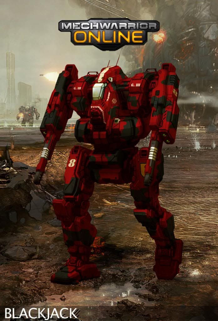
I just finished a reworking of one of my earlier pieces for the 1st Capellan Dragoons, and I'm pretty happy with it (especially with figuring how to get the silly logos to place better).
For comparison:
Before:
...
After:

Agreed it is much better. You are certainly getting the hang of this. Quick tip (though Hayden gave the same one a few pages back), try desaturating your colors a bit for more realism. In real life, that green would appear somewhat duller.


